Mermaid Pie Chart: Syntax, Examples & Templates

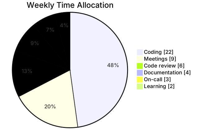
A pie chart shows how a whole divides into parts: budget by category, tickets by type, traffic by source. It suits data with a handful of categories and one meaningful total — and it stops suiting data quickly as categories multiply.
Basic syntax
The declaration is pie showData, where showData prints the numeric value next to each slice label; drop it if you would rather show only percentages. A title line names the chart, and each slice is one line: "Label" : value. Values are plain numbers — they do not need to sum to 100, because the renderer computes percentages from the total. Quote the labels; unquoted labels work for single words, but quoting costs nothing and prevents surprises.
Slices and values
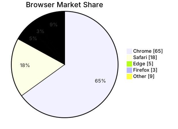
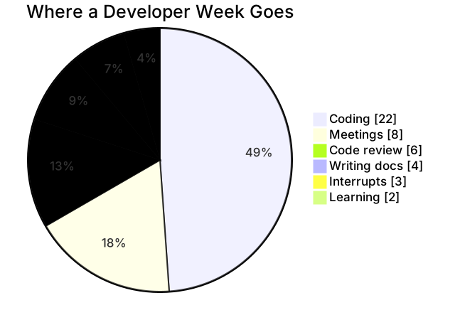
Choose the number of slices before you choose the data. Four to six slices is the readable range; past that, small categories blur together and the chart stops communicating. The two examples above both sit in that range, and both order slices from largest to smallest, which is the convention readers expect. If your data has a long tail — many categories with tiny values — collapse the tail into an “Other” slice rather than listing every one. Negative values and zeros are technically renderable but almost always signal that a pie is the wrong chart for the question.
Common gotchas
Labels are matched literally, so “Login issues” and “Login issue” are two different slices — a typo silently creates a phantom category rather than an error. Values must be bare numbers; units, currency symbols, or thousands separators inside the number break the line. And remember the chart shows proportions only: two datasets with identical proportions but different totals render identically, so put the total in the title (“Support tickets by category, Q3”) when the absolute number matters.
Tips for mobile editing
Keep labels to one or two words so the legend stays readable on a phone-sized render. Enter slices largest-first; it makes the chart look right even before you finish typing and makes omissions obvious. If you find yourself editing values repeatedly, keep the slice lines grouped at the end of the file so they are easy to tap and replace one at a time. The cheatsheet covers the declaration keywords.
When the question is comparison rather than composition, a quadrant chart or a Gantt chart will usually answer it better than another pie.
Pie Chart templates
Every template opens in the editor with the code pre-filled — edit it on your phone or desktop.