Mermaid Quadrant Chart: Syntax, Examples & Templates
Open quadrant chart in the editor
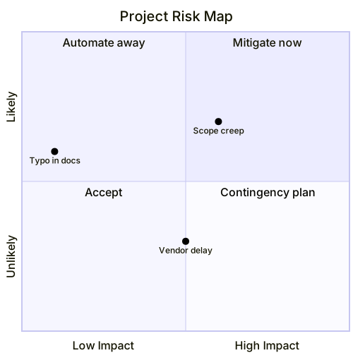
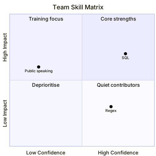
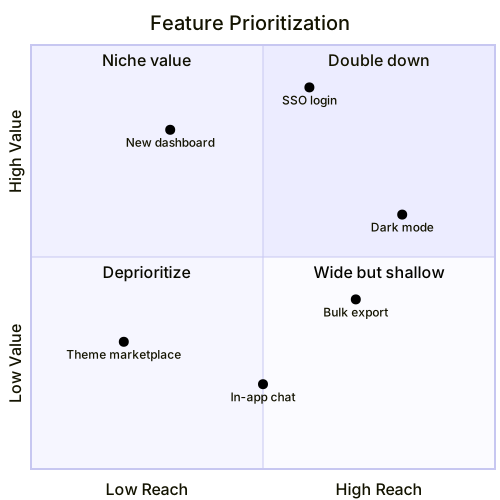
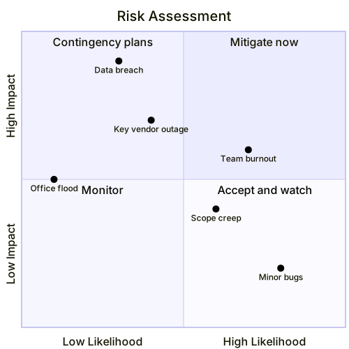
A quadrant chart plots items on two axes and divides the space into four labeled regions. It is the diagram of prioritization: features by reach and value, risks by likelihood and impact, skills by confidence and usefulness. The four region labels do the interpreting for you.
Basic syntax
The declaration is quadrantChart. The title names the chart. The two axes are declared with x-axis Low Reach --> High Reach and y-axis Low Value --> High Value — the text on either side of the arrow labels the minimum and maximum ends. The four quadrants are labeled with quadrant-1 through quadrant-4, numbered counter-clockwise starting from the top-right. Items are one line each: "Search": [0.7, 0.8], where the pair is the position on a 0-to-1 scale for x and y. Quote every item name.
Axes, quadrants and points
Everything depends on choosing axes that are genuinely independent — reach and value, likelihood and impact — because correlated axes collapse the chart into a diagonal line and the quadrants stop meaning anything. Label the axis ends as opposites (“Unlikely —> Likely”), and label the quadrants as actions or categories, not as restatements of the axes: “Mitigate now” tells the reader what to do, “high impact, likely” does not. Place points by judgment unless you have real scores; rough positions are fine, because the quadrant a point lands in matters far more than its exact coordinates. Three to eight points is the readable range.
Common gotchas
The quadrant numbering is the classic trap: quadrant-1 is the top-right, quadrant-2 the top-left, quadrant-3 the bottom-left, quadrant-4 the bottom-right. Labeling them in reading order scatters your labels across the wrong corners. Coordinates are decimals from 0 to 1, so [7, 8] puts an item far outside the chart. Item names must be quoted, and the colon before the bracket pair is required. Axis labels appear on both ends of the arrow, so writing the same word twice (“High —> High”) renders a chart with no contrast. And if two points overlap, nudge them apart — overlapping labels are unreadable even though the data is technically fine.
Tips for mobile editing
Keep item names to one or two words, and type the axis and quadrant lines first; they are the fixed scaffolding, and items are the part you will revise. Round coordinates to one decimal place — [0.7, 0.8] is as precise as the chart can express anyway. When priorities shift, edit coordinates rather than deleting lines, so the item set stays stable. The cheatsheet shows the numbering order in one glance.
For ranked proportions instead of two-dimensional positioning, a pie chart is simpler; for scheduling what the quadrants select, a Gantt chart takes over.
Quadrant Chart templates
Every template opens in the editor with the code pre-filled — edit it on your phone or desktop.