Market Share Pie Chart
The code
pie showData
  title Browser Market Share
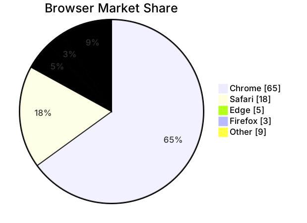
  "Chrome" : 65
  "Safari" : 18
  "Edge" : 5
  "Firefox" : 3
  "Other" : 9
How this template works
A pie chart answers one question: of a single whole, how do the parts divide? Market share is the canonical case — one market, several players, numbers that only mean something together. This template uses illustrative browser figures; swap in your own numbers and the shape of the argument stays the same.
The syntax is short enough to memorize. pie showData declares the chart and turns on value display: showData prints the raw number next to each slice, not just the percentage, which matters when the raw figures are the story. Drop it if you only want proportions. title Browser Market Share names the chart. Each data line has the form "Label" : number — quoted label, colon, value. The values here are percentages that sum to 100, but they do not have to: Mermaid computes each slice’s share from the total, so raw user counts, revenue in thousands, or hours all work identically. Five slices is near the comfortable maximum; beyond that, wedges become hard to tell apart and the chart stops communicating.
The gotchas are quiet ones. Quote every label: a label containing a colon or comma will break parsing unquoted, and the quoted form costs nothing. Duplicate labels are the silent failure — two slices named “Other” render as two slices, and nobody can tell which is which. And a pie only makes sense when the values are parts of one whole: if your numbers are independent counts that do not sum to anything meaningful, the percentages will be arithmetically correct and the chart will be a lie.
To adapt it, replace the labels and values, add or remove slices, and toggle showData to taste. For a slide, keep the title short and let showData carry the numbers; for a report, the opposite trade usually reads better.
Related templates: the time allocation pie for the same chart applied to a work week, the feature prioritization quadrant when you need positioning rather than proportion, and the business model mindmap for the structure behind the numbers. Full reference: the pie chart guide.
Variations to try
- Swap in your own segment names and figures — the chart recomputes percentages from whatever totals you supply.
- Drop showData when you want a cleaner slide and are happy to let the percentage labels carry the numbers.