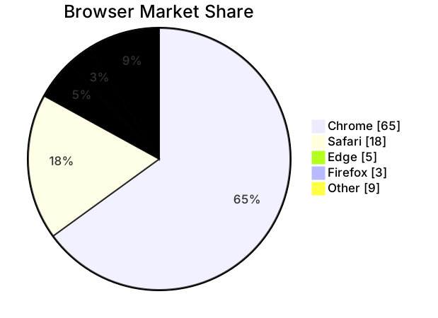
Time Allocation Pie Chart
The code
pie showData
  title Where a Developer Week Goes
  "Coding" : 22
  "Meetings" : 8
  "Code review" : 6
  "Writing docs" : 4
  "Interrupts" : 3
  "Learning" : 2
How this template works
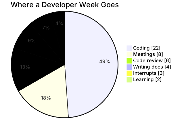
A time audit is the fastest way to start an honest conversation about workload, and a pie chart is the fastest way to run one: six categories, one week, values in hours. The template sums to a 45-hour week, and the picture it draws — barely half the week spent coding — is the kind of finding that ends debates in a planning meeting.
The syntax is the same skeleton as any pie here. pie showData declares the chart and keeps the raw hours visible, which matters in this use because “22” means more to a manager than “49 percent”. title Where a Developer Week Goes names it. Each line is "Label" : number — quoted label, colon, hours — and Mermaid converts the values to percentages automatically, so you never pre-calculate anything. Six slices is the upper edge of readable; if you track more categories, group the small ones into an “Other” slice before charting rather than adding a seventh wedge.
The gotchas: labels must be unique — two slices named “Meetings” will both render and neither will be trustworthy. Keep colons out of labels, or keep them quoted; the quoted form is the habit to build. Values must be positive: a zero renders as an invisible slice, and a negative breaks the chart outright. The deeper gotcha is honesty of the whole — if the hours do not add up to the week you actually worked, the percentages are precise and wrong, and the chart becomes a defense rather than an audit.
To adapt it, run it monthly by multiplying each value, aggregate a team by summing everyone’s hours per category, or flip it to a sprint retrospective by using story points instead of hours. The chart reads the same either way, which is the point.
Related templates: the market share pie for the external version of the same chart, the product sprint plan for scheduling the week this audit describes, and the feature prioritization quadrant for deciding what deserves more of it. Full reference: the pie chart guide.
Variations to try
- Track a full month by multiplying each value by four, or sum a whole team by adding everyone's hours per category.
- Replace hours with story points to run the same audit against a sprint instead of a calendar week.