Feature Prioritization Quadrant
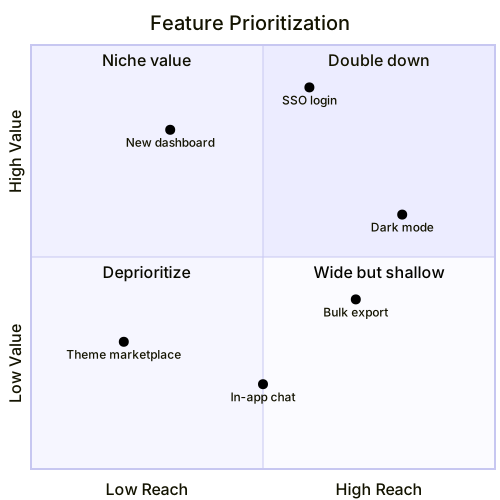
The code
quadrantChart
  title Feature Prioritization
  x-axis Low Reach --> High Reach
  y-axis Low Value --> High Value
  quadrant-1 Double down
  quadrant-2 Niche value
  quadrant-3 Deprioritize
  quadrant-4 Wide but shallow
  "Dark mode": [0.8, 0.6]
  "SSO login": [0.6, 0.9]
  "New dashboard": [0.3, 0.8]
  "Theme marketplace": [0.2, 0.3]
  "Bulk export": [0.7, 0.4]
  "In-app chat": [0.5, 0.2]
How this template works
A prioritization meeting dies without a shared picture, and the quadrant chart is the cheapest way to get one: every feature becomes a dot on two axes, and the four quadrants name the strategy for whatever lands in them. This template plots six candidate features on reach and value, and the argument it makes is visible before anyone speaks — SSO sits high on both axes, the theme marketplace sits low on both, and nobody has to say it out loud.
The syntax: quadrantChart declares the type; title Feature Prioritization names it. x-axis Low Reach --> High Reach and y-axis Low Value --> High Value define the axes — the arrow syntax is required, and the left label is the low end. The four quadrant-N lines name the corners, and the numbering is the part everyone gets wrong: quadrant-1 is the top-right, quadrant-2 the top-left, quadrant-3 the bottom-left, quadrant-4 the bottom-right. So quadrant-1 Double down names the high-reach, high-value corner, and quadrant-2 Niche value names low reach with high value. Points come last: "SSO login": [0.6, 0.9] is a quoted label plus an x, y pair on a 0 to 1 scale, where 1.0 is the right or top edge.
The gotchas: the numbering, again — teams habitually write quadrant-1 as the top-left, and the whole chart then argues for the opposite strategy. Second, coordinates outside 0 to 1 push points off the canvas silently. Third, quote every label; a label containing a comma or colon breaks the line. And place points honestly: the chart’s value is the arguments it starts about coordinates, not the coordinates themselves.
To adapt it, swap the axes to Effort and Impact for the classic matrix, reduce to four points for a focused review, or duplicate the file per quarter and compare how the dots move.
Related templates: the risk assessment quadrant for the same skeleton applied to likelihood and impact, the market share pie for proportion instead of position, and the product roadmap mindmap for the unordered backlog behind the dots. Full reference: the quadrant chart guide.
Variations to try
- Swap the axes to Effort and Impact for the classic effort-impact matrix teams use in planning.
- Reduce to four points for a focused roadmap review where each feature gets real discussion time.