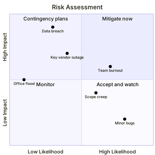
Risk Assessment Quadrant
The code
quadrantChart
  title Risk Assessment
  x-axis Low Likelihood --> High Likelihood
  y-axis Low Impact --> High Impact
  quadrant-1 Mitigate now
  quadrant-2 Contingency plans
  quadrant-3 Monitor
  quadrant-4 Accept and watch
  "Data breach": [0.3, 0.9]
  "Key vendor outage": [0.4, 0.7]
  "Team burnout": [0.7, 0.6]
  "Office flood": [0.1, 0.5]
  "Minor bugs": [0.8, 0.2]
  "Scope creep": [0.6, 0.4]
How this template works
A risk register nobody reads is a liability with extra steps, and the quadrant chart fixes the reading problem: every risk becomes a dot on likelihood and impact, and the quadrant it lands in names the response. This template plots six risks, and the picture does the arguing — the data breach is unlikely but catastrophic, so it sits top-left where the response is a contingency plan, while team burnout is both likely and damaging, top-right, mitigate now.
The syntax: quadrantChart declares the type, title Risk Assessment names it, then the axes — x-axis Low Likelihood --> High Likelihood and y-axis Low Impact --> High Impact, arrow required, left label is the low end. The quadrant lines map corners to responses with the numbering that trips everyone: quadrant-1 is top-right, quadrant-2 top-left, quadrant-3 bottom-left, quadrant-4 bottom-right. So quadrant-1 Mitigate now names the high-likelihood, high-impact corner, and quadrant-2 Contingency plans names the unlikely-but-severe one. Points are "Label": [x, y] on a 0 to 1 scale — "Data breach": [0.3, 0.9] is unlikely and severe, which is exactly where a breach belongs.
The gotchas: the numbering again — writing quadrant-1 as the top-left swaps every response in the chart, and the review will confidently plan for the wrong risks. Second, two risks at identical coordinates overlap and hide one of them; nudge one by 0.05. Third, quote every label, and keep coordinates inside 0 to 1 or the dot leaves the canvas. Last, the honest-placement rule: a register where everything sits bottom-left is a wish list, not an assessment.
To adapt it, rebuild the chart per project phase, add owner names to the labels, or duplicate it per vendor for a supply-chain review.
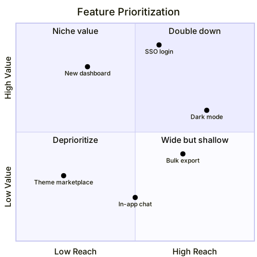
Related templates: the feature prioritization quadrant for the same skeleton on reach and value, the incident response flowchart for the moment a top-right risk fires anyway, and the website launch plan for the schedule these risks threaten. Full reference: the quadrant chart guide.
Variations to try
- Rebuild it per project phase, because a risk that is unlikely in discovery can be near-certain in migration.
- Add owner names to the labels so every dot has a person attached in the review.